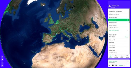
The AI Policy Map

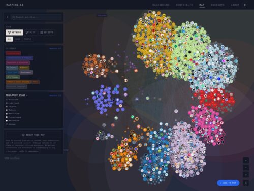
An interactive visualization of the people, organizations, and resources shaping U.S. AI governance.

An interactive visualization of the people, organizations, and resources shaping U.S. AI governance.
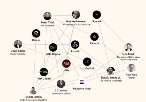
How Tech Billionaires Are Building a Post-Democratic America — And Why Europe Is Next
Under the banner of «patriotic tech», this new bloc is building the infrastructure of control—clouds, AI, finance, drones, satellites—an integrated system we call the Authoritarian Stack. It is faster, ideological, and fully privatized: a regime where corporate boards, not public law, set the rules.
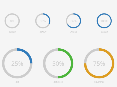
Since we will manage files and dependencies we choose Flask for a quick example. Any other framework could be used, it only consist on importing correctly all libraries.
The libraries used are the following:
Jquery: Common library used almost for anything. (Desc)
Jquery UI: Visual extension for Jquery (Desc, in this case used to create the time slider. We also add another extension (Ui slider pips) to this slider to customize even more.
D3: D3.js is a JavaScript library for manipulating documents based on data. D3 helps you bring data to life using HTML, SVG, and CSS. In this case we use to create a map of Spain. More examples of D3 here.
D3 composite: Extension of D3 that allow to create proyections of maps. For example, in the case of Spain since the canary islands are far away from the peninsula, only using D3 we have a really off center map. This library also provides Spain provinces limits . Important: This library only works with the current set of Jquery and D3 version, if you want to use other versions, check the docs page.
Clusters are built purely with an algorithm. In many cases clustering markers depending on a given geographical entity is better (country, administrative region, zipcode, city, whatever).
People are familiar with such entities, and it avoids putting clusters in locations that don’t feel ‘natural’.
We developed a map where both algorithmical and ‘geographical’ approaches are used (depending on the zoom level) : https://thefoodassembly.com/
So we are both using Leaflet.markercluster and our own cluster logic. They are totally separated, which is a disadvantage because our own clusters don’t benefit from Leaflet.markercluster animations, automatically created clickable polygons, and so on.
D3 and Next are the perfect combination for seamlessly creating reusable, extensible and component-driven interactive dashboards that can be used in literally any industry you can imagine.
With Next JS we can weild the high speed and performance powers to make the UI/UX even more pleasing due to prefetching of all the data that the dashboard is populated with.
Our favorite, most-read or most distinct work since 2014.
Five years ago today, The New York Times introduced The Upshot with the aim of examining politics, policy and everyday life in new ways. We wanted to experiment with formats, using whatever mix of text, data visualizations, images and interactive features seemed best for the subject at hand.
Data visualization is the graphical display of abstract information for two purposes: sense-making (also called data analysis) and communication. Important stories live in our data and data visualization is a powerful means to discover and understand these stories, and then to present them to others. The information is abstract in that it describes things that are not physical. Statistical information is abstract. Whether it concerns sales, incidences of disease, athletic performance, or anything else, even though it doesn’t pertain to the physical world, we can still display it visually, but to do this we must find a way to give form to that which has none. This translation of the abstract into physical attributes of vision (length, position, size, shape, and color, to name a few) can only succeed if we understand a bit about visual perception and cognition. In other words, to visualize data effectively, we must follow design principles that are derived from an understanding of human perception.
Nothing beats the bar chart for fast data exploration and comparison of variable values between different groups, or building a story around how groups of data are composed.
The advantage of bar charts (or “bar plots”, “column charts”) over other chart types is that the human eye has evolved a refined ability to compare the length of objects, as opposed to angle or area.
Luckily for Python users, options for visualisation libraries are plentiful, and Pandas itself has tight integration with the Matplotlib visualisation library, allowing figures to be created directly from DataFrame and Series data objects. This blog post focuses on the use of the DataFrame.plot functions from the Pandas visualisation API.

This tutorial material consists of 21 modules of 15 to 45 minutes, for 2 full days in total. It covers some of the technical / practical aspects of controversy mapping with digital methods. As such, it is designed to complement teaching on the controversy mapping course.
Goal: learn how to harvest and explore data, formulate insights, and build relatable visualizations.
Data: we will mostly use Wikipedia data to keep things relatively simple, but the techniques generalize to other media platforms and datasets.
Tools: we will mostly use Tableau, Gephi, and Jupyter Notebooks. No experience required.
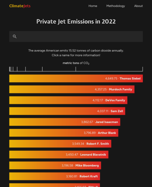
The average American emits 15.52 tonnes of carbon dioxide annually.
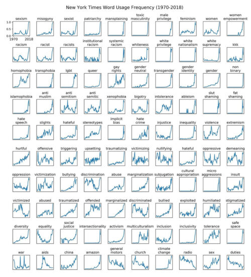
There’s been some talk online about whether we are post peak wokeness. I will have more to say about this when I complete my analysis of several institutions language usage dynamics. For the time being, I provide a timely update of a chart I made in 2019 about prevalence of terms in New York Times news and opinion articles.
This tutorial is meant for D3 v5-v7.
This tutorial is a quick intro to D3.js, a Javascript library for creating interactive data visualizations in the browser. D3 is built on top of common web standards like HTML, CSS, and SVG.
This is not designed to be a deep dive — this tutorial will teach you how to learn D3 and give you a high-level understanding of this powerful tool.
a fork on the classic original because I found the straigth arrows to be more pleasant (especially if using a single color) by changing linkArc() and increasing the arrow length by a little using forceCollide(). I also increased the radius and the text positioning.
Broadly speaking there are 4 steps to setting up a force simulation:
forceSimulation, passing in the array of objectsforceManyBody, forceCenter, forceCollide) to the systemcola.js (A.K.A. «WebCoLa») is an open-source JavaScript library for arranging your HTML5 documents and diagrams using constraint-based optimization techniques.
It works well with libraries like D3.js, svg.js, and Cytoscape.js. The core layout is based on a complete rewrite in Javascript of the C++ libcola library.
It also has an adaptor for d3.js that allows you to use cola as a drop-in replacement for the D3 force layout. The layout converges to a local optimum unlike the D3 force layout, which forces convergence through a simple annealing strategy. Thus, compared to D3 force layout:
The Walkability Index is a tool that allows existing places to be benchmarked and new proposals to be objectively tested in terms of whether they deliver car-dependence, with its associated problems – or walkability, with the social, economic and environmental benefits found in walkable places.
The location of everyday land uses – shops, offices, schools and healthcare facilities – has important effects on our movement choices: whether we reach them by walking or cycling, catching a bus or going by private car.
Sometimes there is no choice: low density, monofunctional housing estates create car dependence. This is not only harmful for the environment but damaging to our mental and physical health. Car-dependency influences obesity and loneliness. In contrast, walkable places are healthy and sociable places.
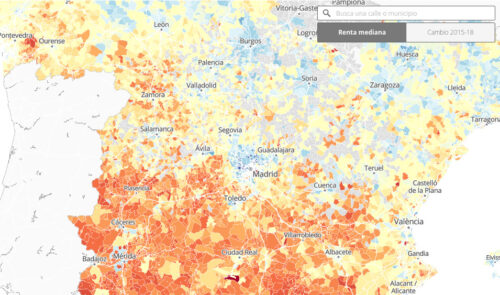
Los nuevos datos del INE, relativos a 2018, revelan las brechas entre Norte y Sur del país y las desigualdades internas en las grandes ciudades
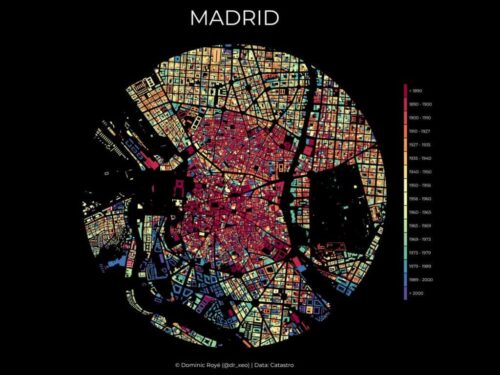
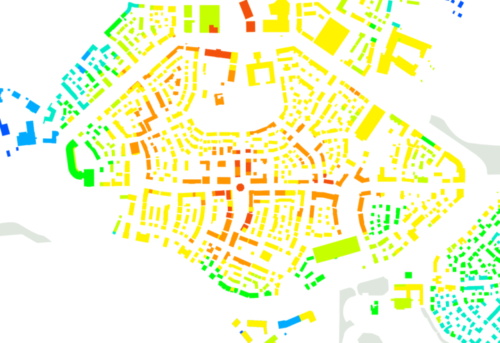
El mapa estaba realizado con datos del catastro que llevan asociados el año de construcción o última reforma. Se presenta un radio de 2,5 km desde el centro de la ciudad. La estética resultante es la de unas vidrieras de estilo rosetón, gracias a su forma circular y su vibrante colorido.
A series of examples for using d3.js utility functions minimally in p5.js without inter-mingling their different paradigms.
I usually handle GIS data in GIS software off course. In this blog post, I’d like to try visualize GIS data with p5.js!
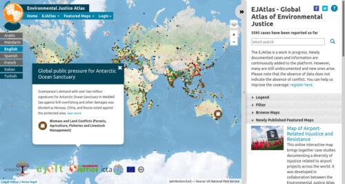
The EJAtlas is a work in progress. Newly documented cases and information are continuously added to the platform. However, many are still undocumented and new ones arise. Please note that the absence of data does not indicate the absence of conflict.
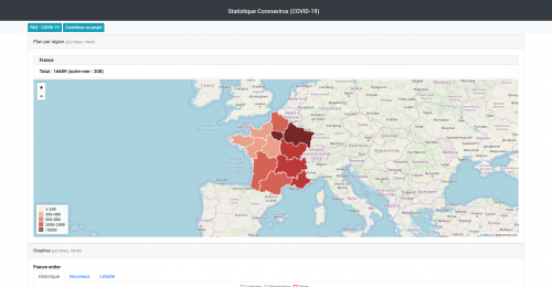
La pandemia de la COVID-19 ha puesto de manifiesto lo importantes que son los datos en general, y sus representaciones gráficas en particular, para la toma de decisiones, de lo personal a lo político, de lo económico a lo social. Hablaremos de las experiencias de visualizar datos del COVID-19 y de la relavancia de los datos en nuestras vidas.
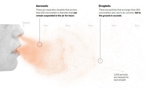
The risk of contagion is highest in indoor spaces but can be reduced by applying all available measures to combat infection via aerosols. Here is an overview of the likelihood of infection in three everyday scenarios, based on the safety measures used and the length of exposure
Alberto Cairo escribe y diseña visualizaciones de datos. En esta entrevista nos cuenta sobre sus libros y sus descubrimientos. El nos dice que “Una visualización es un argumento visual. Necesita tiempo y atención para poder leerlo con cuidado.” Y que no tenemos que usar los gráficos para confirmar lo que creemos. También nos cuenta como son las clases para infografistas y como reflexionan a través de los gráficos. Hablamos de un futuro con más alfabetización visual, donde la gente está más entrenada a leer gráficos y las interpretaciones que proponen. El sostiene que para enseñar infografía es importante enseñar a interpretar los números y que la visualización de datos nos permite entender los números de una manera más crítica.
welcome to the year 2030.
there are 1.2 billion more people on the planet.
70% of us are living in cities now.
in order to house 1.2 billion more people,
all of us are sharing more household goods and services than ever before.
we refer to this sharing as co-living.
and many more of us are living this way now.
but it’s not a new thing.
communal living has always been a solution to common problems.
like rapid urbanisation, loneliness, and high living costs.
but what does co-living look like in the year 2030?
who is it for?
how has it changed our society?
what are we sharing?
with many more of us now co-living,
there is no one configuration.
discover what type of co-living would be uniquely suited for you.
reserve your spot for ONE SHARED HOUSE 2030.

The New York Times prepared a powerful front page for its May 24 print edition, marking the somber milestone of 100,000 coronavirus deaths in the United States.
The newspaper listed the names of 1,000 people who died of COVID-19 — just 1% of the total death toll.
The newspaper staff combed through obituaries and death notices for people whose cause of death was listed as COVID-19, and listed people’s names, ages, and facts about their lives.
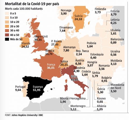
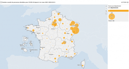
Lo primero que me chocó es la gama de colores del mapa. Lo normal es que se use un color y se aplique una tonalidad que se va oscureciendo conforme los valores son más altos. En este caso el valor más alto es de un color diferente de la gama, El negro no es marrón.
Además, la diferencia de color es muy grande respecto a Italia con una variación del 5%. No sé si esto es intencionado o tan solo un error de diseño. Este mapa va a la galería de ejemplos de malas visualizaciones para mis alumnos. Para colmo, los datos no eran correctos.
Como ya se dieron cuenta @resd9 y @A_Sorines el dato de Bélgica era erróneo en vez de 15,70% era 65,67%. El mapa lo publicó la Vanguardia y ha rectificado el dato aunque mantiene el color negro.
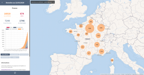
COVID-19 (2019 novel Coronavirus) is a current epidemic as of today. Developers around the world are building applications for the public to get up-to-date and accurate information as quickly as possible.
If you are a developer, you may also be able to contribute to some of these projects.
Teams are making ready-to-use COVID-19 datasets easily accessible for the wider data visualization and analysis community. Johns Hopkins posts frequently updated data on their github page, and Tableau has created a COVID-19 Resource Hub with the same data reshaped for use in Tableau.
These public assets are immensely helpful for public health professionals and authorities responding to the epidemic. They make data from multiple sources easy to use, which can enable quick development of visualizations of local case numbers and impact.
At the same time, the stakes are high around how we communicate about this epidemic to the wider public. Visualizations are powerful for communicating information, but can also mislead, misinform, and — in the worst cases — incite panic. We are in the middle of complete information overload, with hourly case updates and endless streams of information.
This is a short tutorial introducing the basic elements and concepts of D3.