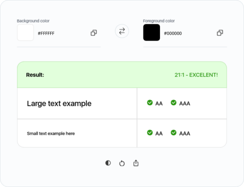
Accessibility Checker – Color Contrast for WCAG Compliance


Forms are commonly used to provide user interaction on websites and in web applications. For example, login, registering, commenting, and purchasing. This tutorial shows you how to create accessible forms. The same concepts apply to all forms, whether they are processed client or server-side.
Aside from technical considerations, users usually prefer simple and short forms. Only ask users to enter what is required to complete the transaction or process; if irrelevant or excessive data is requested, users are more likely to abandon the form.
Forms can be visually and cognitively complex and challenging to use. Accessible forms are easier to use for everyone, including people with disabilities.
Developers most commonly use display: none to hide the content on the page. Unfortunately, this way of hiding content isn’t bulletproof because now that content is now “inaccessible” to screen readers. It’s tempting to use it, but especially in cases where something is only meant to be visually hidden, don’t reach for it.
When developing or redesigning a website or web application, evaluate accessibility early and throughout the development process to identify accessibility problems early, when it is easier to address them.
There are evaluation tools that help with evaluation. However, no tool alone can determine if a site meets accessibility standards. Knowledgeable human evaluation is required to determine if a site is accessible.
The aria-label should be used to provide a text alternative to an element that has no visible text on the screen.
aria-label is an attribute defined in the WAI-ARIA(opens in a new tab) specification. This specification extends native HTML, allowing you to change the way an HTML element is “translated” into the accessibility tree.
Most carousels come along with usability and accessibility issues. To avoid these issues, this article addresses step-by-step design considerations as well as semantic requirements for carousels to be accessible. It is intended to create an in-depth understanding of the implementation and its impact on users.
As widely used as they are, carousel widgets have a bad reputation among UX professionals. They are ignored by users (Nielsen Norman Group), only 1% interact with a carousel at all, and 89% of them only with the first slide (Eric Runyon). Jared Smith even responds to the question “Should I use A Carousel?” by saying, “Seriously, you really shouldn’t.” Others state that there isn’t one answer. You have to consider various factors, such as function, design, platform (desktop or mobile) and, most importantly, context. For whatever reason you include a carousel on a website, make sure it is user-friendly and accessible.
Images with only visual value should have an empty alt attribute set on them. Omitting the alt attribute makes most screen readers read out the entire image URL and providing an alt attribute when the image is for visual purposes only is just as useless.