OpenMapTiles. Open-source maps made for self-hosting

Open-source maps and schema
Host the world maps on your own server or private cloud.
Generate your own vector tiles from selected
OpenStreetMap tags or your geospatial data.

Open-source maps and schema
Host the world maps on your own server or private cloud.
Generate your own vector tiles from selected
OpenStreetMap tags or your geospatial data.
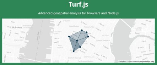
The open-source TypeScript library for publishing interactive, GPU-accelerated maps on the web.
MapLibre GL JS is a TypeScript library that renders interactive maps from vector tiles and MapLibre Style Specification directly in the browser, using WebGL and soon WebGPU for exceptional performance.
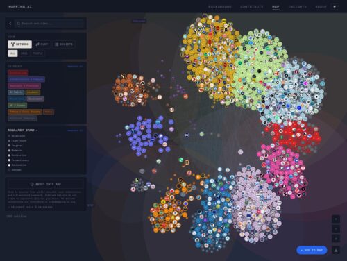
An interactive visualization of the people, organizations, and resources shaping U.S. AI governance.
This post walks through the steps I followed to build a web-based map using Python, Folium, and GeoPandas — from handling shapefiles to adding custom tooltips, interactive toggles, and responsive feedback using JavaScript libraries like AlertifyJS.
In this tutorial, we’ll explore how to create and visualize GeoJSON data, a popular open-source format for representing geographic data, using geojson.io and Folium in Python.
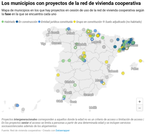
Según los datos de la Red de Vivienda Cooperativa, en todo el territorio español hay alrededor de 200 proyectos de este tipo en marcha, 53 de ellos habitados por cerca de un millar de personas como Déborah y su familia. Como se aprecia en el siguiente mapa, con datos de la red, la mayoría de estos proyectos se ubican en Catalunya, una región con gran tradición cooperativista, pero donde también ha habido un impulso político a esas herramientas residenciales, inicialmente en el ayuntamiento de Barcelona durante el mandato de la alcaldesa Ada Colau, a partir de 2015, que luego se fue extendiendo a otras corporaciones y a instancias autonómicas, con una normativa que da a estas entidades derecho de tanteo y retracto.
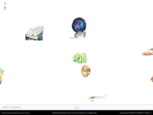
Feral Atlas invites you to navigate the land-, sea-, and airscapes of the Anthropocene. We trust that as you move through the site—pausing to look, read, watch, reflect, and perhaps occasionally scratch your head—you will slowly find your bearings, both in relation to the site’s structure and the foundational concerns and concepts to which it gives form. Feral Atlas has been designed to reward exploration. Following seemingly unlikely connections and thinking with a variety of media forms can help you to grasp key underlying ideas, ideas that are specifically elaborated in the written texts to be found in the “drawers” located at the bottom of every page.
Since we will manage files and dependencies we choose Flask for a quick example. Any other framework could be used, it only consist on importing correctly all libraries.
The libraries used are the following:
Jquery: Common library used almost for anything. (Desc)
Jquery UI: Visual extension for Jquery (Desc, in this case used to create the time slider. We also add another extension (Ui slider pips) to this slider to customize even more.
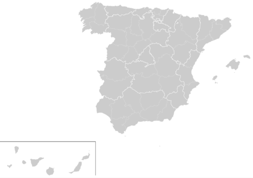
D3: D3.js is a JavaScript library for manipulating documents based on data. D3 helps you bring data to life using HTML, SVG, and CSS. In this case we use to create a map of Spain. More examples of D3 here.
D3 composite: Extension of D3 that allow to create proyections of maps. For example, in the case of Spain since the canary islands are far away from the peninsula, only using D3 we have a really off center map. This library also provides Spain provinces limits . Important: This library only works with the current set of Jquery and D3 version, if you want to use other versions, check the docs page.
Clusters are built purely with an algorithm. In many cases clustering markers depending on a given geographical entity is better (country, administrative region, zipcode, city, whatever).
People are familiar with such entities, and it avoids putting clusters in locations that don’t feel ‘natural’.
We developed a map where both algorithmical and ‘geographical’ approaches are used (depending on the zoom level) : https://thefoodassembly.com/
So we are both using Leaflet.markercluster and our own cluster logic. They are totally separated, which is a disadvantage because our own clusters don’t benefit from Leaflet.markercluster animations, automatically created clickable polygons, and so on.
Plano censo de Ciudad Real / levantado por el Inspector Jefe de Vigilancia Martín Sofi Heredia; revisado y aprobado por le Excmo. Ayuntamiento; dibujó Andrés Ruiz Arche
Escala: 1:1333
Edición: [Ciudad Real : Ayuntamiento, 1925]
Descripción física: 1 plano (entelado); col.; 120×145 cm.
Notas: Incluye nomenclator de calles y claves de colores
Easy to use maps, documentation, code samples, and developer tools for web & mobile.
Our favorite, most-read or most distinct work since 2014.
Five years ago today, The New York Times introduced The Upshot with the aim of examining politics, policy and everyday life in new ways. We wanted to experiment with formats, using whatever mix of text, data visualizations, images and interactive features seemed best for the subject at hand.
why does this particular conversion seem to present so many problems?
I think there are three main reasons:
1. The sort of people that visualise data on Google Maps / Bing Maps are (typically) not GIS professionals. This comment is not in anyway meant to belittle the quality of their data or output. However, the fact is that most GIS professionals still use the commercial (expensive) ESRI ArcGIS product set, and free tools such as Google / Bing are always more likely to attract casual spatial developers. As such, these developers are less likely to know (or want to know) about things like datums, coordinate systems, projections – they just want a map that works.
2. The EPSG code assigned to the projection has changed several times and much of the information displayed on the internet, as well as used in spatial applications themselves, is out-of-date. You’ll see references to EPSG 900913, 3857, 3785, 3587, and various different definitions of each of those systems.
3. The actual projection used by Microsoft / Google itself is (a bit of) a hack, which can lead to misalignment issues when your code actually does the projection the “correct” way. For example, it is common to find issues raised across a number of tools that conversion between WGS84 and Bing / Google Maps leads to Y values that are “out” by about 20km – see the Proj.NET issues here, here, here, here, and here, the ArcGIS API for Silverlight issue here, or the issue for the Proj.4 library reported here, for example.
Coordinate systems are defined using a set of parameters, including the type of projection used (Mercator, Albers etc.), coordinate offset (False Easting, False Northing), the unit of measurement (Metre, Foot etc.), the underlying datum (WGS84, NAD27 etc.) and many more.
Because it’s quite a pain to have to keep quoting this complete set of parameters, every system is commonly referred to by a unique integer code (also called it’s SRID) instead. The set of SRIDs assigned to spatial reference systems in mainstream usage was originally set up by the European Petroleum Survey Group, and they are generally referred to as EPSG codes.
This is a list of online raster tile servers based on OpenStreetMap data.

This tutorial material consists of 21 modules of 15 to 45 minutes, for 2 full days in total. It covers some of the technical / practical aspects of controversy mapping with digital methods. As such, it is designed to complement teaching on the controversy mapping course.
Goal: learn how to harvest and explore data, formulate insights, and build relatable visualizations.
Data: we will mostly use Wikipedia data to keep things relatively simple, but the techniques generalize to other media platforms and datasets.
Tools: we will mostly use Tableau, Gephi, and Jupyter Notebooks. No experience required.
Este documento resume las presentaciones de las Jornadas Técnicas sobre el Concurso del Bosque Metropolitano de Madrid. El bosque se propone como una infraestructura verde que mejorará la salud ambiental y social de la ciudad. Los expertos en diferentes disciplinas discutieron cómo diseñar el bosque para fomentar la biodiversidad, conectar espacios verdes, y apoyar prácticas agrícolas y culturales sostenibles que unan la ciudad con el campo.
Se puede definir a la pendiente como la inclinación de un plano o de una superficie sobre un plano o superficie horizontal.
Esta pendiente se puede expresar o bien en tanto por ciento (%), por ejemplo, una pendiente del 15 %, o bien en grados (º) a través del ángulo de inclinación de la pendiente.
Para calcular la pendiente de una rampa, de un terreno o de una cubierta necesitamos conocer dos datos: la distancia de la pendiente y la altura de la pendiente.
Conocidos estos dos datos, habría que aplicar la siguiente formula para calcular la pendiente en tanto por ciento:
Pendiente (%) = (altura / distancia) x 100
Si lo que necesitamos saber es el ángulo de la pendiente, tenemos que tirar de la función arcotangente (arctg) que es la inversa de la tangente de un ángulo, por lo que habría que aplicar la siguiente formula:
Pendiente (º) = arctg (altura/distancia)
Le nivellement général de la France (NGF) constitue un réseau de repères altimétriques disséminés sur le territoire français métropolitain continental, ainsi qu’en Corse, dont l’IGN a aujourd’hui la charge. Ce réseau est actuellement le réseau de nivellement officiel en France métropolitaine.
In QGIS version 3, there are built-in features to use raster and vector data from OpenStreetMap. There is no built-in possibility to upload changes back to a OpenStreetMap server directly from QGIS. For this purpose, please use one of the Editors.
OpenStreetMap es maravilloso pic.twitter.com/nbQ9BLS4f6
— Alfonso @skotperez (@skotperez) October 8, 2021
Commutometer uses data openly shared by public transport agencies. If your bus is missing, your agency might not be sharing its data.
The Walkability Index is a tool that allows existing places to be benchmarked and new proposals to be objectively tested in terms of whether they deliver car-dependence, with its associated problems – or walkability, with the social, economic and environmental benefits found in walkable places.
The location of everyday land uses – shops, offices, schools and healthcare facilities – has important effects on our movement choices: whether we reach them by walking or cycling, catching a bus or going by private car.
Sometimes there is no choice: low density, monofunctional housing estates create car dependence. This is not only harmful for the environment but damaging to our mental and physical health. Car-dependency influences obesity and loneliness. In contrast, walkable places are healthy and sociable places.
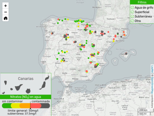
…resultados de las mediciones que la Red Ciudadana de Vigilancia de la Contaminación del Agua por Nitratos realizó en todo el Estado desde mayo de 2021 hasta enero de 2022
La iniciativa MAAAP busca la creación del primer “Territorio inteligente” mapeado por sus propios ciudadanos. Esta es una propuesta interactiva de ciencia ciudadana que tiene como objetivo implicar al alumnado de 4º de ESO, 1º de Bachillerato y Ciclos formativos de FP de Aragón en el entrenamiento de un algoritmo que nos permita diseñar ciudades más habitables.
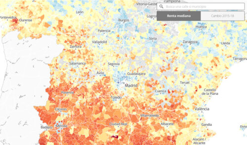
Los nuevos datos del INE, relativos a 2018, revelan las brechas entre Norte y Sur del país y las desigualdades internas en las grandes ciudades
How to apply a filter
* Right-click on the layer listed in panel Layers
* Choose Filter...
* The window Query Builder is displayed
How to build a query in Query Builder
* Double click on a field in Fields list
* Select All in Values
* Choose a operator from Operators
* Double click on a value in Values list
* Your expression is shown at the bottom of the window
* Click Test to have a preview of how many rows are returned
* Click OK to apply the filter
* The layer is displayed according to the filter applied (you see a filter icon aside the layer name in panel Layers)
Como explica en su entrada Daniskarma, el QGIS tiene un complemento llamado Spanish Inspire Catastral Downloader que le permite elegir una provincia y descargar automáticamente los datos, dibujando mapas que nos ayudan en el conocimiento de su análisis y diaganóstico antes de comenzar a intervenir en ellas.
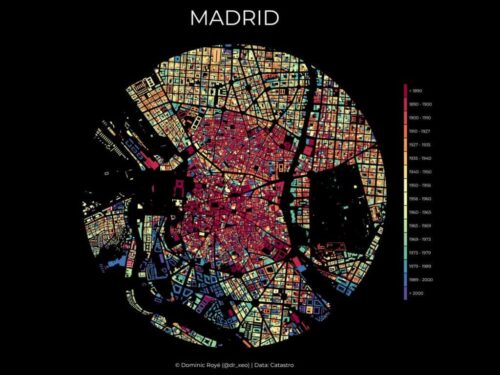
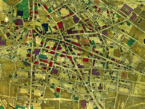
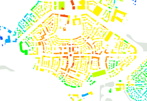
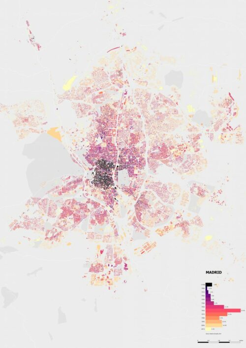
El mapa estaba realizado con datos del catastro que llevan asociados el año de construcción o última reforma. Se presenta un radio de 2,5 km desde el centro de la ciudad. La estética resultante es la de unas vidrieras de estilo rosetón, gracias a su forma circular y su vibrante colorido.
Tiled is a free and open source, easy to use, and flexible level editor.
MapCSS is a specification of style language explicitly designed to describe the look of the OpenStreetMap data
I usually handle GIS data in GIS software off course. In this blog post, I’d like to try visualize GIS data with p5.js!
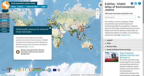
The EJAtlas is a work in progress. Newly documented cases and information are continuously added to the platform. However, many are still undocumented and new ones arise. Please note that the absence of data does not indicate the absence of conflict.
The whole point being made was that we all have been taught geography mainly based on the Mercator projection – as the background in daily television news, the cover of my school atlas, in general the ubiquitous depiction of the planet.
But the basic fact is that a three-dimensional sphere being shown as a single two-dimensional flat image will always be subject to a conversion loss: something has to give…
The reason why Mercator was such an important advance is simple: on it one can draw straight lines to account for travel routes – in the days of the gigantic merchant fleets and naval battles an immensely valuable attribute.
Este material se concibe como una guía con pasos básicos para llevar adelante un proceso de mapeo junto a las y los estudiantes y a partir de algunas ideas y recomendaciones que puedan ser retomadas, ampliadas y mejoradas a partir de la experiencia, y de las temáticas y situaciones que se vayan dando en cada uno de los espacios educativos.
We are allowed to map certain facts from reference imagery in news articles etc.. -though this technically depends on where you are from-. You have to
be fairly certain of the position of each object. They can be a few meters off, but you shouldn’t haphazardly map them.
select sources which are reliable and mention them in your changeset sources or alternatively using the source and source:date tags.
make sure you’re using the right imagery and (if any) offset. This can be adjusted in the editor’s layer menu (in iD, this is located in the right sidebar).
be careful if/when touching existing objects. (You may want to contact the local community, if there is one, to discuss whether they want to map the event to begin with); This may change/remove objects on the map 1) ways which are used for routing 2) areas, such as buildings, or POIs which may be of interest for humanitarian aid.
You will have to use the proper Lifecycle tags (in combination with area=yes where needed).
be sure you know how to map with multipolygons where needed.
as always, look on the wiki for tags and ask the community if you need help mapping.