Data Visualization for Human Perception
Data visualization is the graphical display of abstract information for two purposes: sense-making (also called data analysis) and communication. Important stories live in our data and data visualization is a powerful means to discover and understand these stories, and then to present them to others. The information is abstract in that it describes things that are not physical. Statistical information is abstract. Whether it concerns sales, incidences of disease, athletic performance, or anything else, even though it doesn’t pertain to the physical world, we can still display it visually, but to do this we must find a way to give form to that which has none. This translation of the abstract into physical attributes of vision (length, position, size, shape, and color, to name a few) can only succeed if we understand a bit about visual perception and cognition. In other words, to visualize data effectively, we must follow design principles that are derived from an understanding of human perception.
Eliminate flash of unstyled content
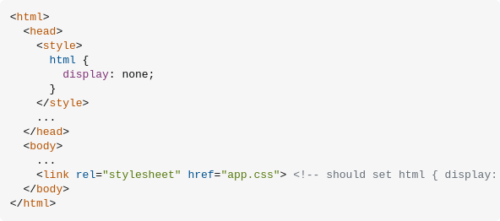
A CSS-only solution…
When to open a link in new tab by default?
Almost all my research online recommended that don’t make it open in a new tab. The main reasons are
1. The default behavior of hyperlinks is that they open within the same page.
2. Let the users choose it themselves.
A Step-By-Step Guide To Building Accessible Carousels
Most carousels come along with usability and accessibility issues. To avoid these issues, this article addresses step-by-step design considerations as well as semantic requirements for carousels to be accessible. It is intended to create an in-depth understanding of the implementation and its impact on users.
As widely used as they are, carousel widgets have a bad reputation among UX professionals. They are ignored by users (Nielsen Norman Group), only 1% interact with a carousel at all, and 89% of them only with the first slide (Eric Runyon). Jared Smith even responds to the question “Should I use A Carousel?” by saying, “Seriously, you really shouldn’t.” Others state that there isn’t one answer. You have to consider various factors, such as function, design, platform (desktop or mobile) and, most importantly, context. For whatever reason you include a carousel on a website, make sure it is user-friendly and accessible.
Los botones de cerrar puertas de los ascensores son (a veces) falsos: su única función es hacerte creer que tienes el control
La razón de esto la explicaron hace un tiempo en medios como el New York Times o Science Alert. Una ley estadounidense llamada ‘Americans With Disabilities Act’ y aprobada en 1990 que buscaba proteger a las personas con discapacidades físicas de situaciones como la de no poder entrar en un ascensor a tiempo antes del cierre de puertas. De repente, por ley, ya no se podían cerrar las puertas voluntariamente si ello implicaba cerrar el paso a alguien que usase una silla de ruedas o unas muletas.
Sin embargo, al mismo tiempo, quedó patente que botones como el de cerrar las puertas de un ascensor dan cierta sensación de control de una situación aunque a nivel efectivo no hagan nada. Esa sensación de control reduce el estrés y la ansiedad, según la profesora Ellen J. Langer de la Universidad de Harvard.
Así que a partir de 1990, todos los ascensores empezaron a fabricarse con botones de cerrar puertas que no hacían nada.

Accessibility Tip: Empty alt Attributes
Images with only visual value should have an empty alt attribute set on them. Omitting the alt attribute makes most screen readers read out the entire image URL and providing an alt attribute when the image is for visual purposes only is just as useless.