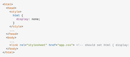
Eliminate flash of unstyled content
A CSS-only solution…
How TO – Lightbox
Learn how to create a modal image gallery (lightbox) with CSS and JavaScript.
Comparing Various Ways to Hide Things in CSS
Developers most commonly use display: none
to hide the content on the page. Unfortunately, this way of hiding content isn’t bulletproof because now that content is now “inaccessible” to screen readers. It’s tempting to use it, but especially in cases where something is only meant to be visually hidden, don’t reach for it.
Defer non-critical CSS
CSS files are render-blocking resources: they must be loaded and processed before the browser renders the page. Web pages that contain unnecessarily large styles take longer to render.
Avoid invisible text during font loading
font-display
is an API for specifying font display strategy. swap
tells the browser that text using this font should be displayed immediately using a system font. Once the custom font is ready, the system font is swapped out.
The Shapes of CSS
CSS is capable of making all sorts of shapes. Squares and rectangles are easy, as they are the natural shapes of the web. Add a width
and height
and you have the exact size rectangle you need. Add border-radius
and you can round that shape, and enough of it you can turn those rectangles into circles and ovals.
A Complete Guide to Flexbox
This complete guide explains everything about flexbox, focusing on all the different possible properties for the parent element (the flex container) and the child elements (the flex items).
Variable fonts guide
Variable fonts are an evolution of the OpenType font specification that enables many different variations of a typeface to be incorporated into a single file, rather than having a separate font file for every width, weight, or style.
The heart of the new variable fonts format is the concept of an axis of variation describing the allowable range of that particular aspect of the typeface design. So the ‘weight axis’ describes how light or how bold the letterforms can be; the ‘width axis’ describes how narrow or how wide they can be; the ‘italic axis’ describes if italic letterforms are present and can be turned on or off accordingly, etc. Note that an axis can be a range or a binary choice. Weight might range from 1–999, whereas italic might be 0 or 1 (off or on).
A Step-By-Step Guide To Building Accessible Carousels
Most carousels come along with usability and accessibility issues. To avoid these issues, this article addresses step-by-step design considerations as well as semantic requirements for carousels to be accessible. It is intended to create an in-depth understanding of the implementation and its impact on users.
As widely used as they are, carousel widgets have a bad reputation among UX professionals. They are ignored by users (Nielsen Norman Group), only 1% interact with a carousel at all, and 89% of them only with the first slide (Eric Runyon). Jared Smith even responds to the question “Should I use A Carousel?” by saying, “Seriously, you really shouldn’t.” Others state that there isn’t one answer. You have to consider various factors, such as function, design, platform (desktop or mobile) and, most importantly, context. For whatever reason you include a carousel on a website, make sure it is user-friendly and accessible.
How To Create Horizontal Scrolling Containers
The Flexbox Method
.scrolling-wrapper-flexbox {
display: flex;
flex-wrap: nowrap;
overflow-x: auto;
.card {
flex: 0 0 auto;
}
}
Leveraging System Fonts on the Web
the CSS fonts spec has a couple (new to me) generic font families, like ui-serif and ui-sans-serif, aimed at providing finer-grained controls for specifying OS-level fonts. This allows developers the power to integrate their UIs with the look and feel of the underlying operating system. To suggest Apple user agents render text on screen with the “New York” serif font, developers can specify: font-family: ui-serif.
BEM – Block Element Modifier
BEM — Block Element Modifier is a methodology that helps you to create reusable components and code sharing in front-end development.
BEM is a highly useful, powerful, and simple naming convention that makes your front-end code easier to read and understand, easier to work with, easier to scale, more robust and explicit, and a lot more strict.
The BEM approach ensures that everyone who participates in the development of a website works with a single codebase and speaks the same language. Using BEM’s proper naming convention will better prepare you for design changes made to your website.
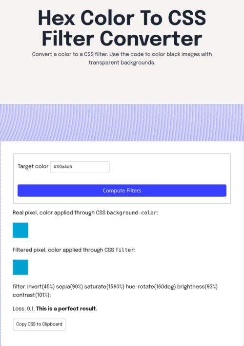
CSS filter generator to convert from black to target hex color
The goal was to be able to create custom style sheets and allow for the coloring of icons
REM to PX Converter
REM to PX Converter is a free online tool you can use to easily convert rem (root em) to px (pixel). Keep in mind that 1rem is equal to the root font-size, in other words, the font-size on element.
Electron. Build cross-platform desktop apps with JavaScript, HTML, and CSS
https://www.youtube.com/watch?v=8YP_nOCO-4Q
Building cross-platform desktop applications comes with a unique set of challenges that can stand in your way when you are trying to transform your ideas into software. Web apps avoid some of these hurdles, but they have limitations that make them impractical for building native desktop applications. Electron lets you harness the best parts of these technologies to build beautiful, cross-platform desktop applications using HTML, JavaScript, and CSS.
This Amazing Image Made of Code Looks Different Based on Your Browser
“When you look at this image on different browsers, you’re kind of looking at the history of the internet and what was demanded of it at the time,» Smith told Motherboard in 2018.
But experimenting with different browsers also reveals a hint of the future: A ton of browsers these days are running Chromium, Google’s open-source browser code. Whereas Pure CSS Lace might have shown off how every browser is unique in the past, it now looks exactly the same on Chrome, Vivaldi, Brave, and Opera.