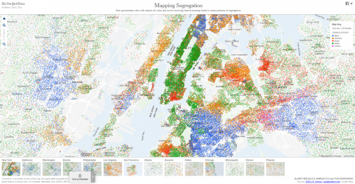
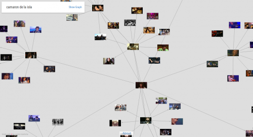
Artworks and rooms of Louvre Museum shown in the latest Beyoncé video


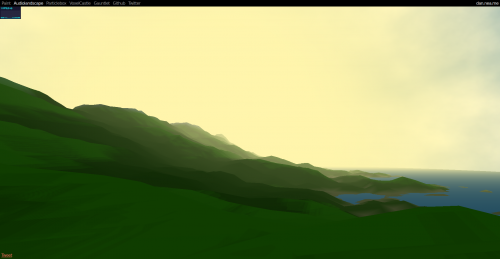
Audio Landscape is a novel music visualizer that constructs a landscape based on the MP3 that you give it.
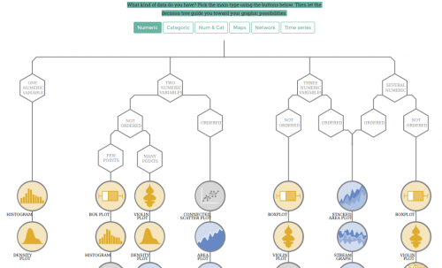
From Data to Viz leads you to the most appropriate graph for your data. It links to the code to build it and lists common caveats you should avoid.
What kind of data do you have? Pick the main type using the buttons below. Then let the decision tree guide you toward your graphic possibilities.
Data visualizations are a powerful way to display and communicate data that otherwise would be impossible to transmit in effective and concise ways. The spread of broadband Internet, the easier access to reusable datasets, the rise in read/write digital media literacies, and the lower barrier to generate data visualizations are making mass media to intensively use of infographics. Newspaper and online news sites are taking advantage of new, affordable and easy to access data visualization tools to broadcast their messages. How can these new tools and opportunities be used effectively? What are good practices regarding data visualization for a general audience?
After an introduction to a series of key concepts about visualizing data the lecture will follow with an analysis of a series of significant data visualizations (tables, pie and bar charts, maps and other systems) from TV, daily newspapers and news websites to detect good and bad practices when visualizing statistical information. The lecturer will then analyze recent literature of visualization studies regarding persuasion, memorability and comprehension. What are more effective embellished or minimal data visualizations? Does graphical presentation of data make a message more persuasive?
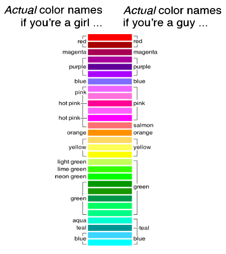
Basically, women were slightly more liberal with the modifiers, but otherwise they generally agreed (and some of the differences may be sampling noise). The results were similar across the survey—men and women tended on average to call colors the same names.
Each user was shown a random color and asked to type in a name. We asked people provide the most generic name possible, dropping things like modifiers (blue instead of light blue). Instead of using the entire RGB spectrum (millions), we pruned the color set to 216 «web safe» colors. This helped ensure every color had many responses. We left it online for a week or so and collected 6,276 color responses.
City Roads hace una sola cosa y la hace bien. A partir del nombre de una ciudad, toma los datos de OpenStreetMap y los vuelca en una espartana imagen bicolor sin texto alguno, con excepción de la ciudad en cuestión. Las únicas opciones que da son elegir esos dos colores: el de las calles y el del fondo.
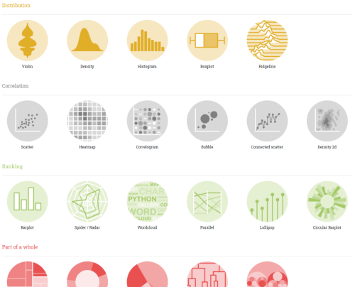
…a collection of simple charts made with d3.js.
This gallery displays hundreds of chart, always providing reproducible & editable source code.
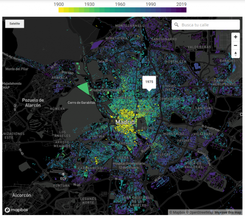
El año en el que más se construyó en España fue 1960. Por primera vez en varias décadas, el país experimentó una estabilidad económica que permitió un pequeño salto en la calidad de vida. Coincidió con el éxodo rural, para el que hicieron falta nuevas construcciones que acogiesen a los recién llegados del campo, y con el origen de un turismo que capitalizaría la economía española hasta nuestros días. La época conocida como el ‘desarrollismo’ propició dos programas de planificación económica y social en torno a zonas industrializadas y de costa que dibujaron el desarrollo urbano de los años posteriores.
Según el castastro, el 17% de construcciones de todas las capitales de provincia data de esa década. Luego llegaron los PAU, que alejaron la vida del casco histórico de las capitales, las grandes urbanizaciones, la burbuja y, también, los cadáveres inmobiliarios de la crisis.
…la fabricación en cadena del Seat 600 hizo que el automóvil pasara de ser un artículo de lujo a una utilidad de clase media, dando lugar a un nuevo enfoque urbanístico: ¿por qué vivir en el centro si ya es posible hacerlo en una casa más amplia sin tardar más de 20 minutos al trabajo?
Nació así el fenómeno del ‘urban sprawl’ o la dispersión urbana, que dio lugar a casi todos los barrios fuera de la M-30, como Aluche, Móstoles o Vallecas, donde se construyeron principalmente edificios de ladrillo; o Fuencarral y Pozuelo, lugares al norte en los que proliferaron las primeras urbanizaciones de chalés.
…este nuevo concepto de Madrid supuso la ruptura de una ciudad centrada en la proximidad, en una ciudad dispersa, basada en el coche.
This is part of a series of examples that describe the basic operation of the D3.js force layout.
…linkDistance tells the force layout the desired distance between connected nodes. It may seem strange that D3 doesn’t simply compel all links to be that distance. The force layout, however, takes other factors into account as well, which sometimes prevents it from achieving the exact link distance in all cases.
…charge, so named because it’s a property that acts like electrical charge on the nodes. With force-directed graphs in particular, charge causes nodes in the graph to repel each other. This behavior is generally desirable because it tends to prevent the nodes from overlapping each other in the visualization.
The Amazon Echo as an anatomical map of human labor, data and planetary resources
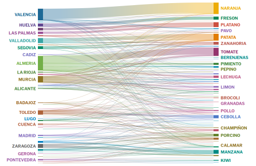
Una exploración sobre los alimentos que pasan por Mercamadrid
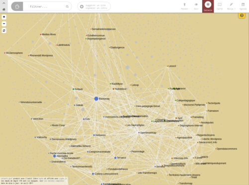
Suite à la liste des sites web en .gouv.fr générée sur le dépôt GitHub gouvfrlist, voici une représentation des domaines et sous-domaines par ministère et administrations (déconcentrées). Nous nous sommes également appuyé sur la liste du top 250 des démarches administratives, la liste des sites en .gouv.fr datant de 2014 et surtout la liste des noms de domaine .fr de l’AFNIC en open data .
Les données ont été retraitées et sont accessible dans ce fichier d’import KUMU et sont publiées sur un jeu de données sur data.gouv.fr
Modes of access and tools to manipulate data have brought marginalized actors to collaboratively create alternative narratives to those delivered by dominant power structures. Non-profit organizations and activist groups increasingly base their campaigns on data, using visualization as an agency tool for change. Data-driven alternative narratives counteract the hegemony of information, questioning the status quo and promoting the non-flattening of the data society, seeking to strengthen democracy. Data visualization is a decisive adversarial tool (DiSalvo, 2012) for turning data into alternative narratives. Translating data into visual representations for alternative narratives is an activist practice that requires a critical approach to data to make a political position evident and coherent.
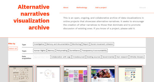
This is an open, ongoing, and collaborative archive of data visualizations in online projects that showcase alternative narratives. It seeks to encourage the creation of other narratives to those that dominate and to promote discussion of existing ones. If you know of a project, please add it.
The Leaflet DVF is an extension to the Leaflet JavaScript mapping library. The primary goal of the framework is to simplify data visualization and thematic mapping using Leaflet – making it easier to turn raw data into compelling maps.
Flapper is a jQuery plugin that replicates the split-flap (or «Solari») displays that used to be common in train stations and airports, and your dad’s alarm clock in the 70s.
To use, just attach Flapper to any input on your page. Whenever the input’s change event is fired, Flapper will update the display.
VivaGraphJS is designed to be extensible and to support different rendering engines and layout algorithms. Underlying algorithms have been broken out into ngraph.
The larger family of modules can be found by querying npm for «ngraph».
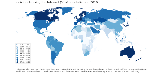
There are different ways of creating choropleth maps in Python. In a previous notebook, I showed how you can use the Basemap library to accomplish this. More than 2 years have passed since publication and the available tools have evolved a lot. In this notebook I use the GeoPandas library to create a choropleth map. As you’ll see the code is more concise and easier to follow along.
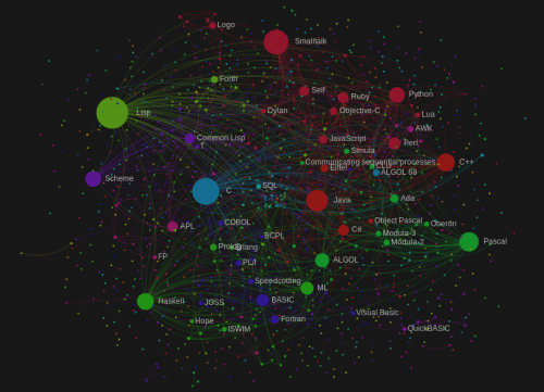
Many datasets are intrinsically hierarchical. Consider geographic entities, such as census blocks, census tracts, counties and states; the command structure of businesses and governments; file systems and software packages. And even non-hierarchical data may be arranged empirically into a hierarchy, as with k-means clustering or phylogenetic trees.
This module implements several popular techniques for visualizing hierarchical data:
Node-link diagrams show topology using discrete marks for nodes and links, such as a circle for each node and a line connecting each parent and child. The “tidy” tree is delightfully compact, while the dendrogram places leaves at the same level. (These have both polar and Cartesian forms.) Indented trees are useful for interactive browsing.
Adjacency diagrams show topology through the relative placement of nodes. They may also encode a quantitative dimension in the area of each node, for example to show revenue or file size. The “icicle” diagram uses rectangles, while the “sunburst” uses annular segments.
Enclosure diagrams also use an area encoding, but show topology through containment. A treemap recursively subdivides area into rectangles. Circle-packing tightly nests circles; this is not as space-efficient as a treemap, but perhaps more readily shows topology.
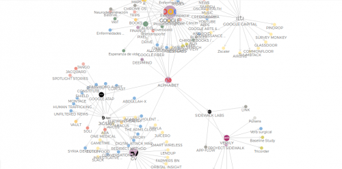
Descripción de las compañías que conforman Alphabet, el gran conglomerado de empresas cuyo principal subsidiaria es Google.
In the last two decades, states have relied on private contractors to support military operations in conflict situations. Without the necessary democratic scrutiny and public debate, Private Military and Security Companies (PMSCs) have provided services that traditionally were performed by national armies and public authorities –such as interrogation of detainees, protection of military assets, training of local armed forces, collection of intelligence and the performance of defensive and even offensive military activities-.
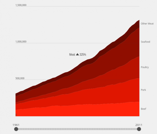
Evolution of world meat consumption from 1961
Global meat consumption per person has nearly doubled since 1961
In this paper, we begin to outline how feminist theory may be productively applied to information visualization research and practice. Other technology and design-oriented fields such as Science and Technology Studies, Human-Computer Interaction, Digital Humanities, and Geography/GIS have begun to incorporate feminist principles into their research. Feminism is not (just) about women,
but rather draws our attention to questions of epistemology – who is included in dominant ways of producing and communicating
knowledge and whose perspectives are marginalized. We describe potential applications of feminist theory to influence the information
design process as well as to shape the outputs from that process.
In this paper, we have outlined six principles for feminist data visualization: Rethink Binaries, Embrace Pluralism, Examine Power and Aspire to Empowerment, Consider Context, Legitimize Embodiment and Affect and Make Labor Visible. These are preliminary and offered for the purposes of beginning a dialogue about how the digital humanities and information visualization communities can productively exchange theories, concepts, and methods. Applying humanistic theories to design processes and artifacts may be new territory for many humanists, just as grappling with questions of subjectivity, power, and oppression may be new territory for many visualization researchers. As data visualization becomes a mainstream technique for making meaning and creating stories about the world, questions of inclusion, authorship,framing, reception, and social impact will become increasingly important. In this regard, the humanities and specifically feminist theory have much to offer.
In the Air is a visualization project which aims to make visible the microscopic and invisible agents of Madrid’s air (gases, particles, pollen, diseases, etc), to see how they perform, react and interact with the rest of the city.
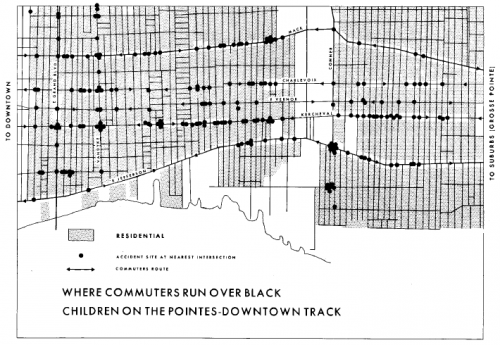
the most important part of the Field Notes III for Gwendolyn Warren was the research on children’s deaths caused by automobile accidents. She described how a great deal of commuter traffic from the affluent white suburbs to the Downtown area passes through the Black community and poses significant threat to the children. On one single corner alone there were six children killed in six months. Just gathering the data that the community already knew to be true posed a difficult problem. No one was keeping detailed records of these deaths, nor making them publicly available. “Even in the information which the police keep, we couldn’t get that information. We had to use political people in order to use them as a means of getting information from the police department in order to find out exactly what time, where, how and who killed that child. (Warren, p. 12)”
This research culminated in the map entitled, provocatively, “Where Commuters Run Over Black Children on the Pointes-Downtown Track”.
As Warren points out in her analysis, the fact that the map establishes a pattern proves that the children’s deaths are not isolated incidents but rather indicative that the spatial and racial injustice of the city leads to the bodily harm of the most vulnerable members of its lower classes. Denis Wood, a geography scholar who has written about the map in various publications, is definitive, “Any Detroiter would have known that these commuters were white and on their way between work downtown and home in the exclusive Pointes communities to the east. That is, this is a map of where white people, as they rush to and from work, run over black children. That is, it is a map of where white adults kill black kids. It is a map of racist infanticide, a racial child-murder map. (Maps and Protest article)”
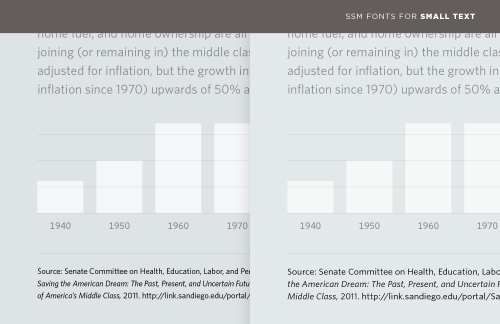
Information can often be divided into data and annotations. A web form needs a way to distinguish entry fields from labels; a graph needs not only labels for its x and y axes, but most crucially a verifiable reference for the source of its data. (#fakenews, I’m looking at you.) The most familiar and obvious way to establish this hierarchy is through type size, using palpably smaller type to distinguish the content from its notes. But at smaller-than-text sizes, even the most lucid typefaces can become difficult to read, their spacing overly tight, their counters congested, and their x-heights measly. Compare the tiny type in these two examples.
The Anti-Eviction Mapping Project is a data-visualization, data analysis, and storytelling collective documenting the dispossession of San Francisco Bay Area residents upon gentrifying landscapes.
D’Ignazio says this issue is compounded by the fact that women and people of color are underrepresented in data science and technical fields in general, a trend that is worsening. She also highlights skewed quantity and quality of data that is collected about various groups of people. For instance, there are very detailed datasets on gross domestic product and prostate function, but very poor datasets on hate crimes and the composition breast milk.
Quickly turn your spreadsheets into stunning online charts, maps and interactive stories.
Una de las formas posibles es comparando la necesidad del mercado de dichos conocimientos, analizando las ofertas de trabajo y viendo si ese “mix” de diseño y programación es más presente ahora que hace unos años.