font-display is an API for specifying font display strategy. swap tells the browser that text using this font should be displayed immediately using a system font. Once the custom font is ready, the system font is swapped out.
Web font optimization is a critical piece of the overall performance strategy. Each font is an additional resource, and some fonts may block rendering of the text, but just because the page is using WebFonts doesn’t mean that it has to render slower. On the contrary, optimized fonts, combined with a judicious strategy for how they are loaded and applied on the page, can help reduce the total page size and improve page rendering times.
Variable fonts are an evolution of the OpenType font specification that enables many different variations of a typeface to be incorporated into a single file, rather than having a separate font file for every width, weight, or style.
The heart of the new variable fonts format is the concept of an axis of variation describing the allowable range of that particular aspect of the typeface design. So the ‘weight axis’ describes how light or how bold the letterforms can be; the ‘width axis’ describes how narrow or how wide they can be; the ‘italic axis’ describes if italic letterforms are present and can be turned on or off accordingly, etc. Note that an axis can be a range or a binary choice. Weight might range from 1–999, whereas italic might be 0 or 1 (off or on).
I came across this use-case where we had to use a specific custom font but it was only available in .otf. However, we want to support multiple formats to ensure even deprecated browsers can load the font. Otf has a global coverage of 97.89% but we didn’t want to take any chances of the font not loading as it’s a crucial feature in our app.
I wanted to convert the font to support the following browsers:
the CSS fonts spec has a couple (new to me) generic font families, like ui-serif and ui-sans-serif, aimed at providing finer-grained controls for specifying OS-level fonts. This allows developers the power to integrate their UIs with the look and feel of the underlying operating system. To suggest Apple user agents render text on screen with the “New York” serif font, developers can specify: font-family: ui-serif.
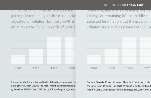
Information can often be divided into data and annotations. A web form needs a way to distinguish entry fields from labels; a graph needs not only labels for its x and y axes, but most crucially a verifiable reference for the source of its data. (#fakenews, I’m looking at you.) The most familiar and obvious way to establish this hierarchy is through type size, using palpably smaller type to distinguish the content from its notes. But at smaller-than-text sizes, even the most lucid typefaces can become difficult to read, their spacing overly tight, their counters congested, and their x-heights measly. Compare the tiny type in these two examples.