I came across this use-case where we had to use a specific custom font but it was only available in .otf. However, we want to support multiple formats to ensure even deprecated browsers can load the font. Otf has a global coverage of 97.89% but we didn’t want to take any chances of the font not loading as it’s a crucial feature in our app.
I wanted to convert the font to support the following browsers:
onts are vector data that gets rasterized when displayed to the user. Computer displays are low-DPI devices for complex reasons, and such DPI (96) is not enough to display fonts without a myriad of trade-offs. Most notable are sub-pixel rendering, sub-pixel positioning, font hinting and anti-aliasing. You can read up more here and here if you want the full background.
Each operating system approaches font rendering differently. To get Windows-like rendering that I prefer, anti-aliasing, sub-pixel rendering, sub-pixel positioning and font hinting based on byte code embedded into fonts – basically, every step of the technological progress made in the last 30 years – need to be active.
If we’re not running a full blown desktop environment like GNOME, KDE or XFCE, the chances of getting good font rendering in a post Xorg installation after a default linux base (think of arch or voidlinux) install is zero. This guide serves as a list of todo items to get decent font rendering with these sort of installs.
the CSS fonts spec has a couple (new to me) generic font families, like ui-serif and ui-sans-serif, aimed at providing finer-grained controls for specifying OS-level fonts. This allows developers the power to integrate their UIs with the look and feel of the underlying operating system. To suggest Apple user agents render text on screen with the “New York” serif font, developers can specify: font-family: ui-serif.
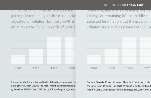
Information can often be divided into data and annotations. A web form needs a way to distinguish entry fields from labels; a graph needs not only labels for its x and y axes, but most crucially a verifiable reference for the source of its data. (#fakenews, I’m looking at you.) The most familiar and obvious way to establish this hierarchy is through type size, using palpably smaller type to distinguish the content from its notes. But at smaller-than-text sizes, even the most lucid typefaces can become difficult to read, their spacing overly tight, their counters congested, and their x-heights measly. Compare the tiny type in these two examples.