
Fonts for Complex Data. Few ways to make quick work of their long lists, tiny annotations, and mighty stacks of numbers

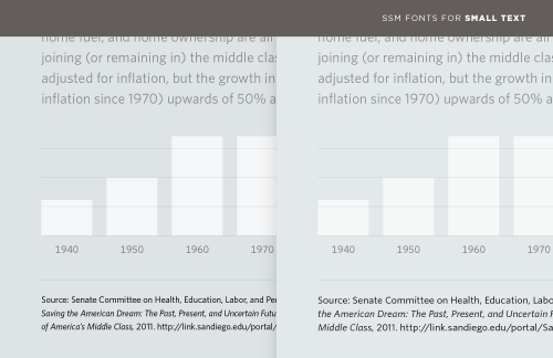
Information can often be divided into data and annotations. A web form needs a way to distinguish entry fields from labels; a graph needs not only labels for its x and y axes, but most crucially a verifiable reference for the source of its data. (#fakenews, I’m looking at you.) The most familiar and obvious way to establish this hierarchy is through type size, using palpably smaller type to distinguish the content from its notes. But at smaller-than-text sizes, even the most lucid typefaces can become difficult to read, their spacing overly tight, their counters congested, and their x-heights measly. Compare the tiny type in these two examples.