Erupción de La Palma

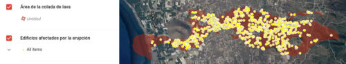
Primer mapa del impacto de la lava del volcán en La Palma a partir de imágenes satelitales. Fuente: Copernicus – Comisión Europea

Primer mapa del impacto de la lava del volcán en La Palma a partir de imágenes satelitales. Fuente: Copernicus – Comisión Europea
OpenStreetMap offers many possibilities for creating high resolution paper maps. Unlike commercial map services such as Mapquest and Google Maps, there are only a few restrictions on what you can do with OSM images.
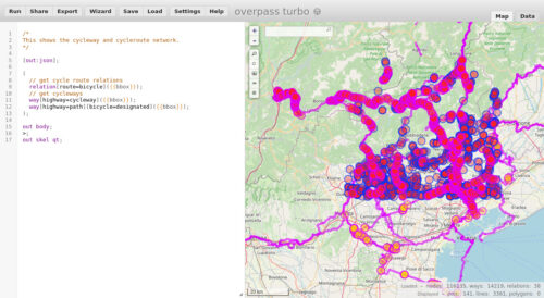
This page explains how to get existing OSM data from the web and how to convert it to an SVG image via Osmarender.
Osmarender isn’t a usual application. Instead, it’s a set of files which let you perform an XSL transformation.
GUI written in Python to parse OSM (OpenStreetMap) files and render them onscreen. Layers may be toggled on/off and drawing may be customized.
This program allows a user to render OSM files within the GUI. The GUI enables the user to easily modify which layers are visible and the style of these layers.
The program exports maps as images.
a process by which you can generate your own custom-made stylized maps. A stylized map is a map where the user can specify which data layers are visualized, as well as define the style with which each layer is visualized. I will first describe the process through which you can write software to stylize maps, followed by an example of the Python software I wrote to perform this task.
The region is specified by a bounding box, which consists of a minimum and maximum latitude and longitude. Choose as small a region as will be useful to you, since larger regions will result in larger data files, longer download times, and heavier load on the server. The server may reject your region if it is larger than 1/4 degree in either dimension. When you’re first starting out, choose a very small region so that you can figure things out quickly with small data sets.
There are several ways of finding latitude and longitude values. Since we are interested in a bounding box, perhaps the clearest way is to use the bounding box selection features of the ‘export data’ link. On the homepage map pan and zoom to roughly the right area, and then click the ‘export data’ (link on the left). This sidebar display includes the four values you need for a bounding box matching the extents of the viewport. Click ‘Manually select a different area’ and then drag a box to select exactly the region you want.
You must now construct an API request URL as specified in the map request docs. In the URL, a bounding box is expressed as four comma-separated numbers, in this order: left, bottom, right, top (min long, min lat, max long, max lat). Latitude and longitude are expressed in decimal degrees. North latitude is positive, south latitude is negative. West longitude is negative, east longitude is positive. The method described in the previous section will give you suitable values.
Example:
https://api.openstreetmap.org/api/0.6/map?bbox=11.54,48.14,11.543,48.145
The API is limited to bounding boxes of about 0.5 degree by 0.5 degree and you should avoid using it if possible. For larger areas you might try to use XAPI, for example:
http://overpass.openstreetmap.ru/cgi/xapi_meta?*[bbox=11.5,48.1,11.6,48.2]
Refer to the XAPI page for details of other servers available.
You can just type this URL into a browser if you want, but that may not work as well as you’d hope, especially if the data is large. If you know how to use them, command-line tools like wget and curl will do a better job.
If you’ve specified a region with a lot of data, you may have to wait a while before the HTTP response begins (the server is crunching your request). If your client times out, try setting options for a longer timeout, or choose a smaller region.
Here’s an example command line for wget:
wget -O muenchen.osm "https://api.openstreetmap.org/api/0.6/map?bbox=11.54,48.14,11.543,48.145"
It supports loading GPX tracks, background imagery, and OSM data from local sources as well as from online sources and allows to edit the OSM data (nodes, ways, and relations) and their metadata tags.
JOSM is open source and licensed under GPL
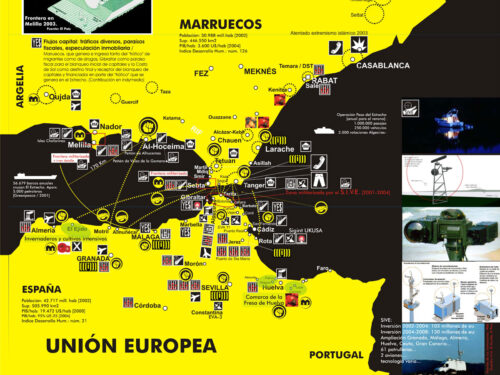
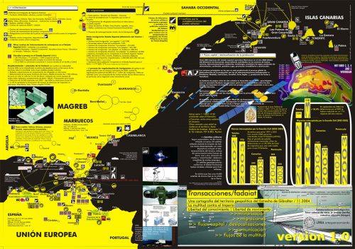
A lo largo del año 2004 un equipo colaborativo desarrolló el proyecto titulado “Una cartografía del territorio geopolítico del Estrecho de Gibraltar”. El producto visible de esta colaboración fueron dos mapas en papel (cara a y b) que presentaban lecturas alternativas de este territorio singular. El proyecto surgió de la red Indymedia Estrecho y vinculado a Fadaiat 2004, un encuentro de artistas, activistas y tecnólogos entre las dos orillas del Estrecho. Se trataba de presentar la visión desde la perspectiva de estas redes de este espacio geográfico como lugar de conflictos sociopolíticos, y también de presentar su propio trabajo como proyecto de transformación de este territorio. Las tres líneas principales de investigación-acción de Indymedia Estrecho se reflejaban en la cartografía: 1/ migraciones y frontera; 2/ nueva composición del trabajo, precarización; y 3/ comunicación independiente y conocimiento libre. En la cara a de la cartografía se mapeaban como flujos que atravesaban la frontera los procesos que venían ocurriendo en el Estrecho: militarización, migraciones, deslocalización del capital, comunicación y movimientos sociales. En la cara b se presentaban las redes de movimientos sociales activas a ambos lados de la frontera, así como sus proyectos políticos a corto y medio plazo – con lo que el mapa se convertía además en una herramienta de organización.
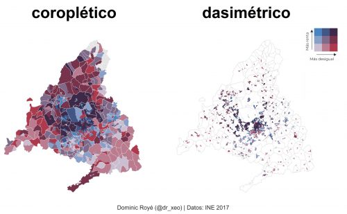
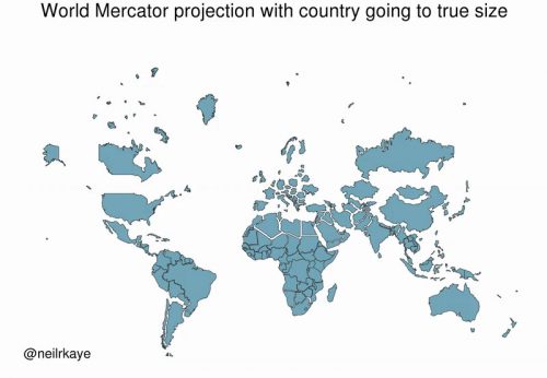
Hace poco hice un mapa de las desigualdades vía el uso de coropletas. Pero estos tipos de mapas suelen distorsionar la relación entre la verdadera geografía subyacente y la variable representada.
Se debe a que las divisiones administrativas no suelen coincidir con la realidad geográfica. Además, grandes areas aparentan tener un peso que no tienen. Para reflejar mejor la realidad se hace uso de distribuciones más realista de la población como puede ser el uso de suelo.
Con técnicas de Sistemas de Información Geográfica es posible redistribuir la variable de interés en función de una variable más realista a menor unidad espacial. En este caso usé el uso de suelo urbano con 100 m de resolución.
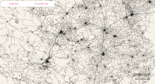
This website renders every single road within a city
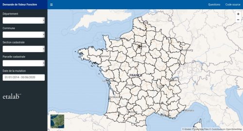
Cette application est proposée par Etalab, département de la DINUM, et permet de visualiser les données DVF (demandes de valeurs foncières), correspondant aux mutations à titre onéreux réalisées les 5 dernières années. Les données DVF brutes sont téléchargeables sur le site https://www.data.gouv.fr depuis le 24 avril 2019 et sont produites par la direction générale des Finances publiques. Vous y trouverez des informations sur le cadre technique et légal de cette publication.
A quoi correspond le prix affiché ?
Il s’agit dun prix «net vendeur», c’est-à-dire ne comprenant ni frais d’agence immobilière, ni frais de notaire. En cas de vente de mobilier (une cuisine équipée par exemple) avec le bien immobilier, le montant de ce mobilier n’est pas compris dans le prix affiché. La TVA est incluse.
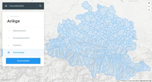
Le projet Github france-geojson propose au format GeoJSON les cartes des régions, départements, arrondissements, cantons et communes de France (métropole et départements d’outre-mer) à partir des données publiées par l’IGN et l’INSEE.
Ce site permet de rechercher, visualiser et télécharger individuellement chacun de ces fichiers dans un format optimisé. Pour plus de détails ou pour accèder à la version non optimisée des tracés, cliquez sur le bouton ci-dessous.
5.x implementation of a choropleth map, using Promises.
A pretty specific title, huh? The versioning is key in this map-making how-to. D3.js version 5 has gotten serious with the Promise class which resulted in some subtle syntax changes that proven big enough to cause confusion among the D3.js old dogs and the newcomers. This post guides you through creating a simple map in this specific version of the library. If you’d rather dive deeper into the art of making maps in D3 try the classic guides produced by Mike Bostock.
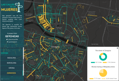
Proyecto colaborativo de Geochicas para producir un mapa a partir de las calles que cuenten con un nombre de alguna mujer en Latinoamérica y España. Esta propuesta busca enlazar y generar contenidos en OSM y Wikipedia sobre mujeres destacadas.
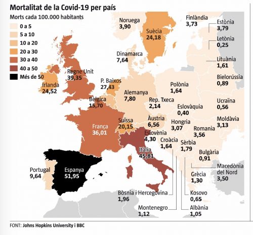
Lo primero que me chocó es la gama de colores del mapa. Lo normal es que se use un color y se aplique una tonalidad que se va oscureciendo conforme los valores son más altos. En este caso el valor más alto es de un color diferente de la gama, El negro no es marrón.
Además, la diferencia de color es muy grande respecto a Italia con una variación del 5%. No sé si esto es intencionado o tan solo un error de diseño. Este mapa va a la galería de ejemplos de malas visualizaciones para mis alumnos. Para colmo, los datos no eran correctos.
Como ya se dieron cuenta @resd9 y @A_Sorines el dato de Bélgica era erróneo en vez de 15,70% era 65,67%. El mapa lo publicó la Vanguardia y ha rectificado el dato aunque mantiene el color negro.
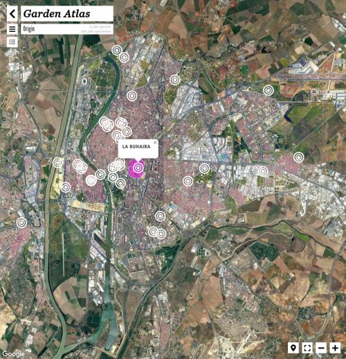
Es una plataforma digital diseñada por Nomad Garden para propiciar nuevos acercamientos a los jardines. Una herramienta que, vinculando arte, ciencia y tecnología, permite identificar las especies de un jardín sin ser un experto; medir los efectos ambientales que éstas generan sobre el entorno; crear contenidos o eventos de manera sencilla; visualizar la información de forma atractiva con textos, imágenes y delicados mapas*; difundir los contenidos a través de web y móvil, o formar parte de una comunidad en la que ya están presentes jardines como los del Real Alcázar de Sevilla, El parque de María Luisa, Arboleda Digital, El jardín de Magallanes, El jardín Cosmopolita o el Palacio de las Dueñas y entidades como el Patronato del Real Alcázar de Sevilla, el IAPH (Instituto Andaluz de Patrimonio Histórico), MECD (Ministerio de Educación, Cultura y Deporte del Gobierno de España), la Casa de Alba, el Área de Educación y el Área de Cultura del Ayuntamiento de Sevilla o asociaciones como ACPP.
Descubre, cartografía y difunde contenidos sobre los jardines y sus especies, visualizando los efectos que producen sobre el cuerpo, el ambiente y la cultura.
A javascript component to create terrific cartography ! GoGoCartoJs is the autonomous frontend part of the GoGoCarto Project
So although many of us have to stay in, there are still ways that we can help—by simply improving the map. We’ve been talking with the mapping community to find out what the current mapping priorities are and how you can help. Here are some of the mapping attributes that are increasingly important in the current environment:
Hospitals/clinics including facilities and surrounds: This includes the opening hours, addresses, services provided, building outlines, and helipads for countries where air ambulances are commonly used.
Pharmacies: Opening hours, locations and addresses.
Supermarkets, marketplaces, and convenience stores: Opening hours, locations and addresses.
Banks, ATMs, electronic money transfers: Particularly important with global economic disruption.
We highly encourage mapping some of the above features in an area you care about. There are also some existing tasks that you can help complete.
Hospitals in the Philippines with MapRoulette
Global health sites mapping with Healthsites
Health care clinic information globally with MapContrib
Hospital outlines and surrounds in Qom, Iran with MapRoulette
Hospital outlines and surrounds in Tehran province, Iran with MapRoulette
Importing pharmacies in Catalonia, Spain with OSM Tasking Manager
Enriching hospital data in Istanbul with MapRoulette
There was to be no outbreak of cholera in New Orleans, nor among the residents who fled. Despite raw sewage and decomposing bodies floating in the toxic brew that drowned the city, cholera was never likely to happen: there was little evidence that the specific bacteria that cause cholera were present. But the point had been made: Katrina had reduced a great American city to Third World conditions. Twenty-first-century America had had a cholera scare.
…on certain maps, in Switzerland’s more remote regions, there is also, curiously, a spider, a man’s face, a naked woman, a hiker, a fish, and a marmot. These barely-perceptible apparitions aren’t mistakes, but rather illustrations hidden by the official cartographers at Swisstopo in defiance of their mandate “to reconstitute reality.” Maps published by Swisstopo undergo a rigorous proofreading process, so to find an illicit drawing means that the cartographer has outsmarted his colleagues.
City Roads hace una sola cosa y la hace bien. A partir del nombre de una ciudad, toma los datos de OpenStreetMap y los vuelca en una espartana imagen bicolor sin texto alguno, con excepción de la ciudad en cuestión. Las únicas opciones que da son elegir esos dos colores: el de las calles y el del fondo.
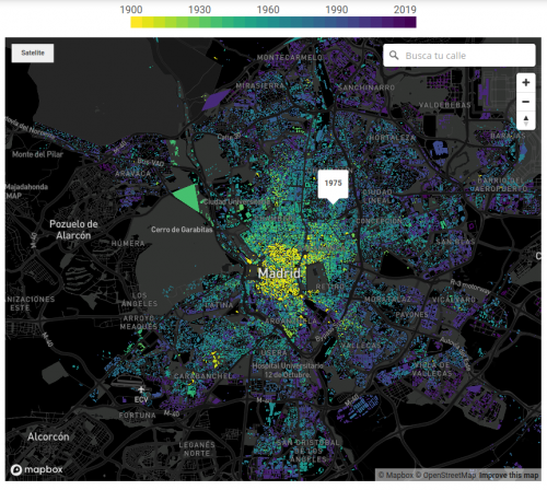
El año en el que más se construyó en España fue 1960. Por primera vez en varias décadas, el país experimentó una estabilidad económica que permitió un pequeño salto en la calidad de vida. Coincidió con el éxodo rural, para el que hicieron falta nuevas construcciones que acogiesen a los recién llegados del campo, y con el origen de un turismo que capitalizaría la economía española hasta nuestros días. La época conocida como el ‘desarrollismo’ propició dos programas de planificación económica y social en torno a zonas industrializadas y de costa que dibujaron el desarrollo urbano de los años posteriores.
Según el castastro, el 17% de construcciones de todas las capitales de provincia data de esa década. Luego llegaron los PAU, que alejaron la vida del casco histórico de las capitales, las grandes urbanizaciones, la burbuja y, también, los cadáveres inmobiliarios de la crisis.
…la fabricación en cadena del Seat 600 hizo que el automóvil pasara de ser un artículo de lujo a una utilidad de clase media, dando lugar a un nuevo enfoque urbanístico: ¿por qué vivir en el centro si ya es posible hacerlo en una casa más amplia sin tardar más de 20 minutos al trabajo?
Nació así el fenómeno del ‘urban sprawl’ o la dispersión urbana, que dio lugar a casi todos los barrios fuera de la M-30, como Aluche, Móstoles o Vallecas, donde se construyeron principalmente edificios de ladrillo; o Fuencarral y Pozuelo, lugares al norte en los que proliferaron las primeras urbanizaciones de chalés.
…este nuevo concepto de Madrid supuso la ruptura de una ciudad centrada en la proximidad, en una ciudad dispersa, basada en el coche.
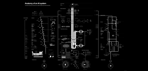
The Amazon Echo as an anatomical map of human labor, data and planetary resources
Following Deleuze and Guattari’s premise of cartography as a tool of action rather than representation, DeSoto was part of the collective that founded hackitectura.net, a platform engaged in critically visualizing geopolitical power relations.
hackitectura.net experienced a continuous interest in cartography as a tool for both the acquisition of critical knowledge but also as a form of activism.
Rather than representing a pre-existing world, cartography implies the identification of new relations, territories and machines, new ways of agencing and ‘subjectivity production.’
We need maps to keep on organizing the protection of the commons, natural and cultural ones (even though this difference doesn’t make sense anymore). Water, air, and culture are all under critical threat in our current time. We are at war, the Fourth World War as the Zapatistas coined it, against Neoliberalism and the ultra-right movements.
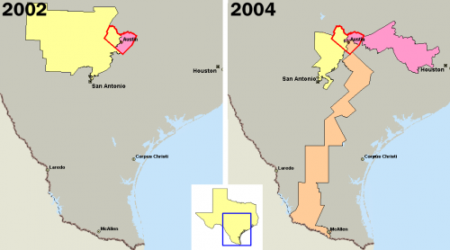
Gerrymandering is a practice intended to establish a political advantage for a particular party or group by manipulating district boundaries.
The Leaflet DVF is an extension to the Leaflet JavaScript mapping library. The primary goal of the framework is to simplify data visualization and thematic mapping using Leaflet – making it easier to turn raw data into compelling maps.
d3.geomap is a library for creating geographic maps that are rendered in a Web browser. d3.geomap is written in JavaScript using features introduced in EcmaScript 6 and later and built on top of D3.js.
There are different ways of creating choropleth maps in Python. In a previous notebook, I showed how you can use the Basemap library to accomplish this. More than 2 years have passed since publication and the available tools have evolved a lot. In this notebook I use the GeoPandas library to create a choropleth map. As you’ll see the code is more concise and easier to follow along.
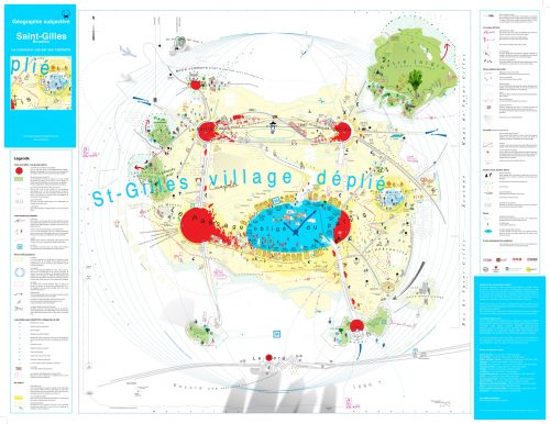
La commune de Sant Gilles, Bruxelles vue par ses habitants.
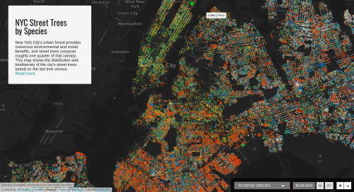
New York City’s urban forest provides numerous environmental and social benefits, and street trees compose roughly one quarter of that canopy. This map shows the distribution and biodiversity of the city’s street trees based on the last tree census.
In the last two decades, states have relied on private contractors to support military operations in conflict situations. Without the necessary democratic scrutiny and public debate, Private Military and Security Companies (PMSCs) have provided services that traditionally were performed by national armies and public authorities –such as interrogation of detainees, protection of military assets, training of local armed forces, collection of intelligence and the performance of defensive and even offensive military activities-.