Autonomía digital y tecnológica

Código e ideas para una internet distribuida

Linkoteca. Catherine D'Ignazio


Data-centric thinking is rapidly becoming vital to the waywe work, communicate and understand in the 21st century.This has led to a proliferation of tools for novices that helpthem operate on data to clean, process, aggregate, and vi-sualize it. Unfortunately, these tools have been designedto supportusersrather thanlearnersthat are trying todevelop strong data literacy. This paper outlines a basicdefinition of data literacy and uses it to analyze the toolsin this space. Based on this analysis, we propose a set ofpedagogical design principles to guide the development oftools and activities that help learners build data literacy.We outline a rationale for these tools to be stronglyfocused,wellguided, veryinviting, and highlyexpandable. Based onthese principles, we offer an example of a tool and accom-panying activity that we created. Reviewing the tool as acase study, we outline design decisions that align it withour pedagogy. Discussing the activity that we led in aca-demic classroom settings with undergraduate and graduatestudents, we show how the sketches students created whileusing the tool reflect their adeptness with key data literacyskills based on our definition. With these early results inmind, we suggest that to better support the growing num-ber of people learning to read and speak with data, tool de-signers and educators must design from the start with thesestrong pedagogical principles in mind.

We have chosen to put this draft online because of a foundational principle of this project: that all knowledge is incomplete, and that the best knowledge is gained by bringing together multiple partial perspectives. A corollary to this principle is that our own perspectives are limited, especially with respect to the topics and issues that we have not personally experienced.

In this paper, we begin to outline how feminist theory may be productively applied to information visualization research and practice. Other technology and design-oriented fields such as Science and Technology Studies, Human-Computer Interaction, Digital Humanities, and Geography/GIS have begun to incorporate feminist principles into their research. Feminism is not (just) about women,
but rather draws our attention to questions of epistemology – who is included in dominant ways of producing and communicating
knowledge and whose perspectives are marginalized. We describe potential applications of feminist theory to influence the information
design process as well as to shape the outputs from that process.

In this paper, we have outlined six principles for feminist data visualization: Rethink Binaries, Embrace Pluralism, Examine Power and Aspire to Empowerment, Consider Context, Legitimize Embodiment and Affect and Make Labor Visible. These are preliminary and offered for the purposes of beginning a dialogue about how the digital humanities and information visualization communities can productively exchange theories, concepts, and methods. Applying humanistic theories to design processes and artifacts may be new territory for many humanists, just as grappling with questions of subjectivity, power, and oppression may be new territory for many visualization researchers. As data visualization becomes a mainstream technique for making meaning and creating stories about the world, questions of inclusion, authorship,framing, reception, and social impact will become increasingly important. In this regard, the humanities and specifically feminist theory have much to offer.

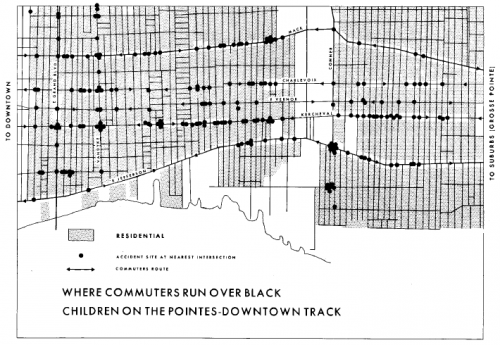
Where Commuters Run Over Black Children on the Pointes-Downtown Track

the most important part of the Field Notes III for Gwendolyn Warren was the research on children’s deaths caused by automobile accidents. She described how a great deal of commuter traffic from the affluent white suburbs to the Downtown area passes through the Black community and poses significant threat to the children. On one single corner alone there were six children killed in six months. Just gathering the data that the community already knew to be true posed a difficult problem. No one was keeping detailed records of these deaths, nor making them publicly available. “Even in the information which the police keep, we couldn’t get that information. We had to use political people in order to use them as a means of getting information from the police department in order to find out exactly what time, where, how and who killed that child. (Warren, p. 12)”

This research culminated in the map entitled, provocatively, “Where Commuters Run Over Black Children on the Pointes-Downtown Track”.

As Warren points out in her analysis, the fact that the map establishes a pattern proves that the children’s deaths are not isolated incidents but rather indicative that the spatial and racial injustice of the city leads to the bodily harm of the most vulnerable members of its lower classes. Denis Wood, a geography scholar who has written about the map in various publications, is definitive, “Any Detroiter would have known that these commuters were white and on their way between work downtown and home in the exclusive Pointes communities to the east. That is, this is a map of where white people, as they rush to and from work, run over black children. That is, it is a map of where white adults kill black kids. It is a map of racist infanticide, a racial child-murder map. (Maps and Protest article)”

D’Ignazio says this issue is compounded by the fact that women and people of color are underrepresented in data science and technical fields in general, a trend that is worsening. She also highlights skewed quantity and quality of data that is collected about various groups of people. For instance, there are very detailed datasets on gross domestic product and prostate function, but very poor datasets on hate crimes and the composition breast milk.