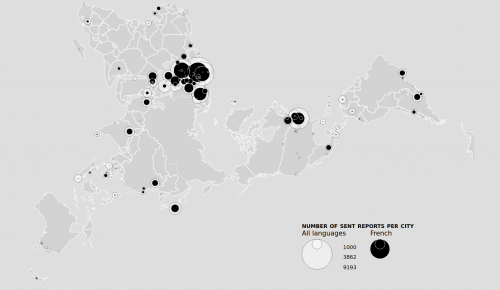
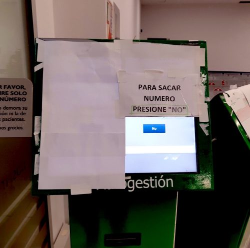
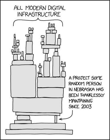
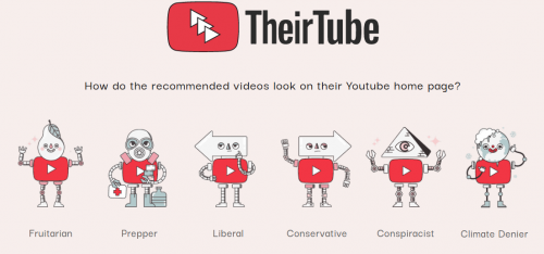
Autonomie numérique et technologique

Code et idées pour un internet distribué

Linkothèque. Carnet de bord. Page 22


Using intersection observer

If you’ve written lazy loading code before, you may have accomplished your task by using event handlers such as scroll or resize. While this approach is the most compatible across browsers, modern browsers offer a more performant and efficient way to do the work of checking element visibility via the intersection observer API.

Me da miedo que se aplaudan decisiones coercitivas como el confinamiento forzoso que, incluso pudiendo ser necesario, es el resultado del fracaso de la propia ciudadanía para actuar cívicamente y evitar en la medida de sus posibilidades las interacciones sociales

The WordPress Foundation owns and oversees the trademarks for the WordPress and WordCamp names and logos. We have developed this trademark usage policy with the following goals in mind:

We’d like to make it easy for anyone to use the WordPress or WordCamp name or logo for community-oriented efforts that help spread and improve WordPress.
We’d like to make it clear how WordPress-related businesses and projects can (and cannot) use the WordPress or WordCamp name and logo.
We’d like to make it hard for anyone to use the WordPress or WordCamp name and logo to unfairly profit from, trick or confuse people who are looking for official WordPress or WordCamp resources.

Captura de pantalla de "Coronavirus Map: U.S. Cases Surpass 10,000"

The number of known cases of the coronavirus in the United States surged past 10,000 on Thursday morning as testing expanded and the virus spread. As of Friday morning, at least 12,392 people across every state, plus Washington, D.C., and three U.S. territories, have tested positive for coronavirus, according to a New York Times database, and at least 195 patients with the virus have died.

Ostensibly a chat app, WeChat is actually a superapp, because it seamlessly integrates many services and products. It is the way the vast majority of Chinese citizens communicate with friends and family. For some, it is a medical scheduling app, used to make and manage doctor’s appointments. And it is a wallet, the means by which users buy groceries, access their bank accounts, pay their mortgages, and engage in just about any financial transaction.

Shutting down a WeChat account is, in effect, a digital form of banishment for the many users who have opted into its ecosystem. Not only is the user cut off from communicating with friends and family, but in what is increasingly becoming a cashless society, it effectively denies users who have concentrated their money in WeChat Wallet the ability to independently function.

U.S.-based tech companies often deal with these and other wide-ranging country and regional-specific speech restrictions via something known as geo-blocking, which enables them to restrict in one region content that is otherwise permitted by the terms of service and thus accessible elsewhere. Implicit in this approach is a recognition of the obligation to comply with local law, even if it means complying with takedown and keep-off demands that run contrary to free speech commitments elsewhere.

Foro para la discusión sobre la creación de respiradores / ventiladores abiertos. Estamos recopilando información, de forma colectiva, para el diseño de dispositivos médicos, abiertos, que ofrezcan alternativas en caso de necesidad.

Digitization of cultural heritage over last 20 years has opened up very interesting possibilities for the study of our cultural past using computational “big data” methods. Today, as over two billion people create global “digital culture” by sharing their photos, video, links, writing posts, comments, ratings, etc., we can also use the same methods to study this universe of contemporary digital culture.

In this chapter I discuss a number of issues regarding the “shape” of the digital visual collections we have, from the point of view of researchers who use computational methods. They are working today in many fields including computer science, computational sociology, digital art history, digital humanities, digital heritage and Cultural Analytics – which is the term I introduced in 2007 to refer to all of this research, and also to a particular research program of our own lab that has focused on exploring large visual collections.

Regardless of what analytical methods are used in this research, the analysis has to start with some concrete existing data. The “shapes” of existing digital collections may enable some research directions and make others more difficult. So what is the data universe created by digitization, what does it make possible, and also impossible?

Across the globe, a coronavirus culture is emerging, spontaneously and creatively, to deal with public fear, restrictions on daily life, and the tedious isolation of quarantine. “This is a bad science-fiction movie that is real,” Agustín Fuentes, an evolutionary anthropologist at the University of Notre Dame, told me, in a late-night discussion this week, about how COVID-19 may alter the human journey. He envisions a profound evolutionary process to insure the survival of the species as pandemics become more common. It’s already visible.

La globalización capitalista es biológicamente insostenible en ausencia de una infraestructura sanitaria pública internacional. Pero nunca existirá hasta que se acabe con el poder de las farmacéuticas y la sanidad con ánimo de lucro.

Al igual que lo hacen las gripes anuales, el virus está mutando a medida que atraviesa poblaciones con composiciones etarias e inmunidades adquiridas diferentes. La variedad que seguramente llegará a los estadounidenses ya es ligeramente diferente a la del brote original de Wuhan.

Sin embargo, no muy a menudo se reconoce que un 60% de la mortalidad mundial tuvo lugar en el oeste de la India, donde la exportación de cereales hacia el Reino Unido y unas brutales prácticas de requisamiento coincidieron con una grave sequía. La escasez de alimentos resultante condujo a millones de personas pobres al borde de la inanición. Se convirtieron en víctimas de una siniestra sinergia entre malnutrición, que inhibió su respuesta inmunitaria a la infección, y una neumonía bacteriana y vírica galopante. En otro caso, en el Irán ocupado por los británicos, varios años de sequía, cólera y escasez de alimentos, seguidos de un brote generalizado de malaria, sentaron las condiciones previas para la muerte de aproximadamente una quinta parte de la población.

…as consecuencias desconocidas de la relación entre malnutrición e infecciones existentes, debería alertarnos de que el COVID-19 podría seguir un camino diferente y mucho más mortífero en los suburbios de África y del sur de Asia. El peligro para los pobres del mundo ha sido ignorado casi por completo por los periodistas y por los gobiernos occidentales. El único artículo que he visto publicado afirma que como la población urbana de África Occidental es la más joven del mundo, la pandemia debería tener allí solo un impacto leve. En vista de la experiencia de 1918, la extrapolación parece ridícula. Nadie sabe lo que pasará en las próximas semanas en Lagos, Nairobi, Karachi o Calcuta. Lo único que es seguro es que los países ricos y las clases ricas se concentrarán en salvarse a sí mismas y prescindirán de la solidaridad internacional y de la ayuda médica. Muros y no vacunas: ¿puede haber un modelo más malvado para el futuro?

El acceso a las medicinas vitales, incluidas las vacunas, los antibióticos y los antivirales deberían ser un derecho humano, y estar universalmente disponibles sin coste alguno. Si los mercados no pueden proporcionar los incentivos para producir de forma barata estos fármacos, entonces los gobiernos y las organizaciones sin ánimo de lucro deberían asumir la responsabilidad de fabricarlas y distribuirlas. La supervivencia de los pobres debe considerarse una prioridad mayor que las ganancias de las grandes farmacéuticas.

…parece que la globalización capitalista es biológicamente insostenible en ausencia de una infraestructura sanitaria pública verdaderamente internacional

There was to be no outbreak of cholera in New Orleans, nor among the residents who fled. Despite raw sewage and decomposing bodies floating in the toxic brew that drowned the city, cholera was never likely to happen: there was little evidence that the specific bacteria that cause cholera were present. But the point had been made: Katrina had reduced a great American city to Third World conditions. Twenty-first-century America had had a cholera scare.

Teams are making ready-to-use COVID-19 datasets easily accessible for the wider data visualization and analysis community. Johns Hopkins posts frequently updated data on their github page, and Tableau has created a COVID-19 Resource Hub with the same data reshaped for use in Tableau.

These public assets are immensely helpful for public health professionals and authorities responding to the epidemic. They make data from multiple sources easy to use, which can enable quick development of visualizations of local case numbers and impact.

At the same time, the stakes are high around how we communicate about this epidemic to the wider public. Visualizations are powerful for communicating information, but can also mislead, misinform, and — in the worst cases — incite panic. We are in the middle of complete information overload, with hourly case updates and endless streams of information.

COVID19 is currently spreading exponentially, in a mostly unchecked fashion, throughout the world. Infection doubling rates are as high as 2-3 days. Under simplistic models, such unchecked growth means the disease infects most of the world in months. Current statistics indicate that 15-20% of people who get it require hospitalization for respiratory failure for multiple weeks, and often need intense healthcare from medical professionals who are at severe risk treating these highly infectious patients. If infections proceed at their current pace across the globe, we will not have enough supplies like ventilators, respirators, PPE, etc. to meet demand.

This group is being formed to evaluate, design, validate, and source the fabrication of open source emergency medical supplies around the world, given a variety of local supply conditions.

A marmot hiding in plain sight in the Swiss Alps

…on certain maps, in Switzerland’s more remote regions, there is also, curiously, a spider, a man’s face, a naked woman, a hiker, a fish, and a marmot. These barely-perceptible apparitions aren’t mistakes, but rather illustrations hidden by the official cartographers at Swisstopo in defiance of their mandate “to reconstitute reality.” Maps published by Swisstopo undergo a rigorous proofreading process, so to find an illicit drawing means that the cartographer has outsmarted his colleagues.

Captura de pantalla de la web From Data to Viz

From Data to Viz leads you to the most appropriate graph for your data. It links to the code to build it and lists common caveats you should avoid.

What kind of data do you have? Pick the main type using the buttons below. Then let the decision tree guide you toward your graphic possibilities.

Data visualizations are a powerful way to display and communicate data that otherwise would be impossible to transmit in effective and concise ways. The spread of broadband Internet, the easier access to reusable datasets, the rise in read/write digital media literacies, and the lower barrier to generate data visualizations are making mass media to intensively use of infographics. Newspaper and online news sites are taking advantage of new, affordable and easy to access data visualization tools to broadcast their messages. How can these new tools and opportunities be used effectively? What are good practices regarding data visualization for a general audience?

After an introduction to a series of key concepts about visualizing data the lecture will follow with an analysis of a series of significant data visualizations (tables, pie and bar charts, maps and other systems) from TV, daily newspapers and news websites to detect good and bad practices when visualizing statistical information. The lecturer will then analyze recent literature of visualization studies regarding persuasion, memorability and comprehension. What are more effective embellished or minimal data visualizations? Does graphical presentation of data make a message more persuasive?

Basically, women were slightly more liberal with the modifiers, but otherwise they generally agreed (and some of the differences may be sampling noise). The results were similar across the survey—men and women tended on average to call colors the same names.

Color Naming Perception Chart

Each user was shown a random color and asked to type in a name. We asked people provide the most generic name possible, dropping things like modifiers (blue instead of light blue). Instead of using the entire RGB spectrum (millions), we pruned the color set to 216 « web safe » colors. This helped ensure every color had many responses. We left it online for a week or so and collected 6,276 color responses.

Miquela nace en 2016. Un perfil de Instagram daba comienzo a su historia: una joven hispano-brasileña, residiendo en Los Ángeles y proyectando identidad de IT-Girl comenzaba su rastro digital suscitando todo tipo de especulaciones (como que era una campaña para promocionar el juego Los Sims). Después de tres años ya sabemos un poco de qué va la historia: « un estudio transmedia que crea universos narrativos y personajes digitales ». Esto es lo que puede leerse en la escueta web (es un Google Doc en realidad) de presentación de Brud.